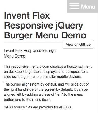
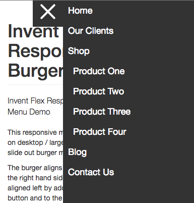
This responsive menu plugin displays a horizontal menu on desktop / large tablet displays, and collapses to a slide out burger menu on smaller mobile devices.
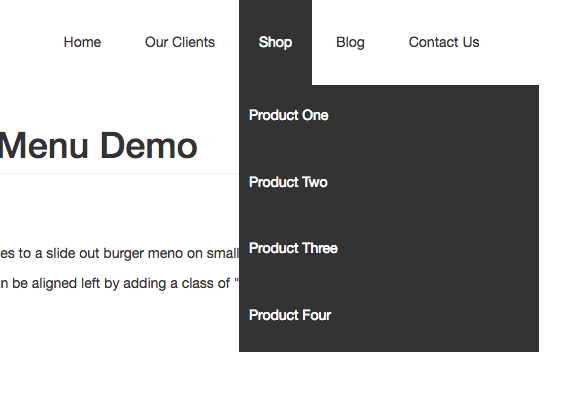
The menu supports tow tier "drop down" style desktop menus, with the submenus displayed in an accessible fashion on the mobile version.
The burger aligns right by default, and will slide out of the right hand side of the screen by default. It can be aligned left by adding a class of "left" to the menu button and to the menu itself.
SASS source files are provided for all CSS.
To use this plugin, simply add the following code to your <head> (you may wish to put the JS in your page footer for performance reasons):
<link rel="stylesheet" href="https://cdn.rawgit.com/InventPartners/flex-responsive-burger-menu/master/css/nav.min.css" />
<script src="https://cdn.rawgit.com/InventPartners/flex-responsive-burger-menu/master/js/nav.min.js"></script>
The menu button (visible on mobile only) is marked up using an id of "inv-nav-main-btn" thus:
<button type="button" id="inv-nav-main-btn" class="hamburger right">
	<span class="hamburger-box">
		<span class="hamburger-inner"></span>
	</span>
	<span class="text">Menu</span>
</button>
The class "hamburger" styles this as a hamburger using CSS based upon the excellent Tasty CSS-animated hamburgers by Todd Motto (https://github.com/jonsuh/hamburgers). We'd recommend you download this too if you want to try out some of his other effects in your menu button.
The menu itself is marked up by adding an id of "inv-menu" thus:
<ul id="inv-menu" class="right">
	<li><a href="#">Home</a></li>
	<li><a href="#">Our Clients</a></li>
	<li>
		<a href="#">Shop</a>
		<ul>
			<li><a href="#">Product One</a></li>
			<li><a href="#">Product Two</a></li>
			<li><a href="#">Product Three</a></li>
			<li><a href="#">Product Four</a></li>
		</ul>
	</li>
	<li><a href="#">Blog</a></li>
	<li><a href="#">Contact Us</a></li>
</ul>
Add a class of "left" to #inv-nav-main-btn and #inv-menu if you want the mobile menu to be left aligned, rather than left aligned.
© 2026 Invent Partners Ltd | Supporters of FdA Web Design, Wakefield